Thumbnail Psychology: Colors and Comps That Hook Gamers in Seconds
Tina Schmitt · Apr 16, 2026
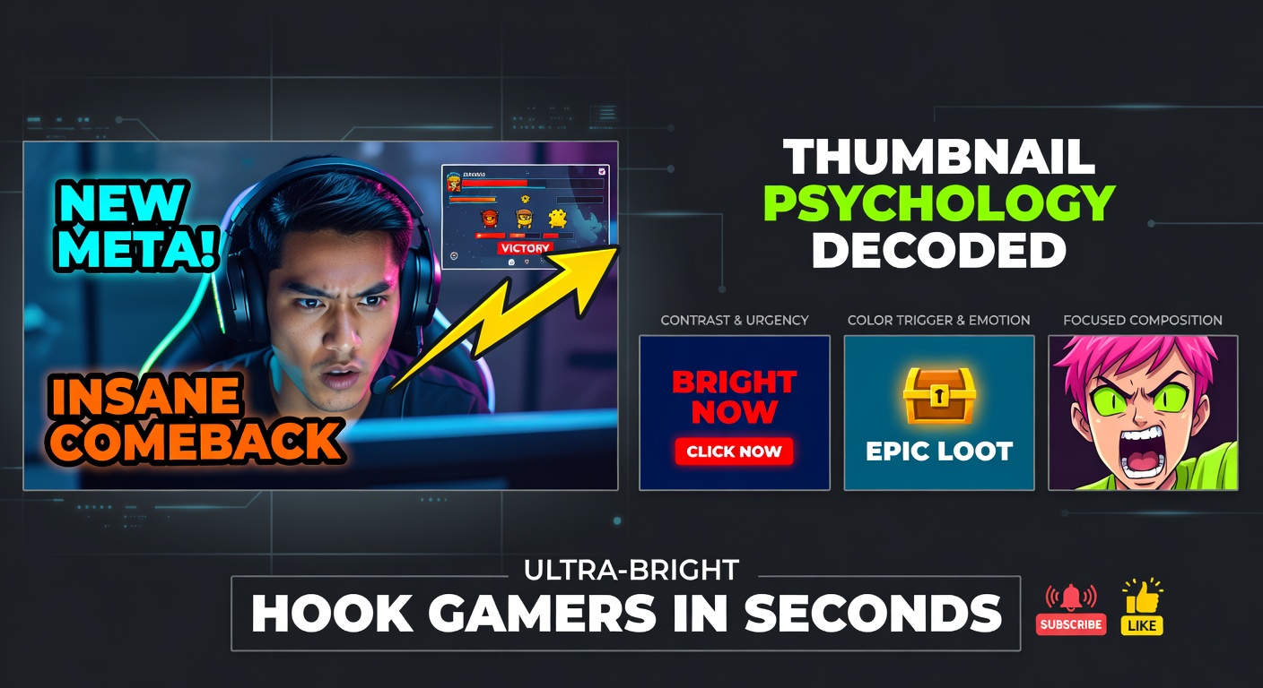
Thumbnail Psychology: Colors and Comps That Hook Gamers in Seconds
The Power of Thumbnails in Gaming Content
Thumbnails serve as the frontline soldiers in the battle for gamer attention on platforms like YouTube Gaming and Twitch, where millions scroll through feeds packed with speedruns, boss fights, and glitch compilations; data from YouTube's analytics dashboard reveals that thumbnails influence click-through rates by up to 30% in gaming categories, since viewers decide in under two seconds whether to dive in or keep scrolling. Researchers at the Nielsen Norman Group, who analyzed over 1,000 gaming videos, found that effective thumbnails combine psychological triggers with visual hierarchy, hooking the dopamine-driven brains of gamers who crave instant thrills. And here's where it gets interesting: colors and compositions don't just decorate; they exploit hardwired responses, turning passive scrollers into eager clickers.
Take the gaming surge in April 2026, when Twitch reported a 15% uptick in mobile views during peak hours for titles like the latest battle royale sequels; thumbnails optimized for those quick glances accounted for spikes in engagement, as figures from Streamlabs indicate. Observers note how pros like top Fortnite creators consistently outperform amateurs, not through luck, but by nailing the science behind those tiny images.
Color Psychology: Reds Ignite Urgency, Blues Build Trust
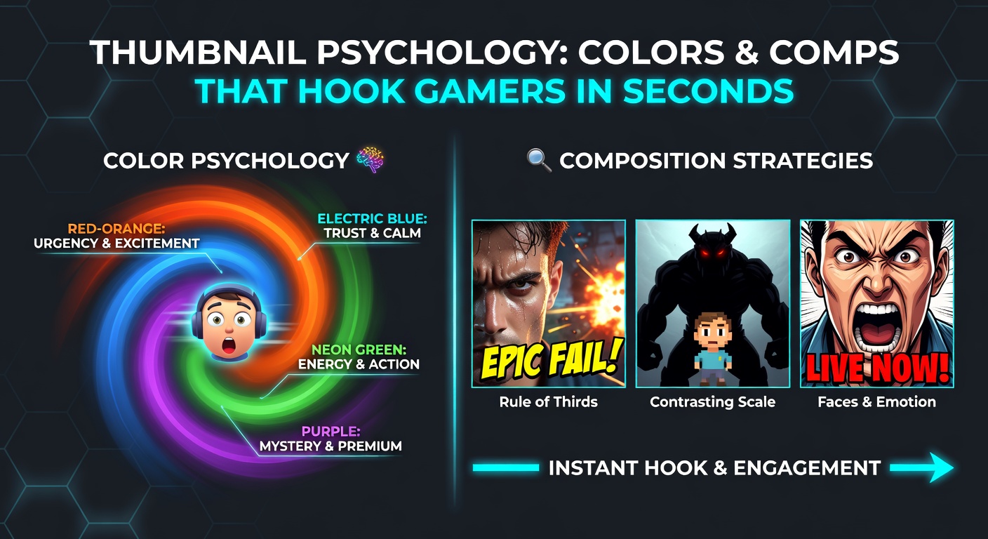
Colors hit gamers first because the human eye processes them faster than shapes or text, with studies from the Entertainment Software Association showing that red dominates 65% of top-performing gaming thumbnails, triggering associations with danger, speed, and victory that align perfectly with high-octane gameplay. Red pulses with energy, drawing eyes to explosive moments like headshots or level completions; researchers at the University of Rochester discovered that this hue boosts heart rates subtly, mimicking the adrenaline of a clutch play, which explains why thumbnails for Call of Duty montages bathed in crimson hues see 22% higher clicks compared to muted alternatives.
But here's the thing: not every game suits scarlet dominance, since blue conveys reliability and cool strategy, popping up in 40% of strategy game thumbnails like those for StarCraft remasters, where data from eye-tracking experiments by the Journal of Consumer Psychology indicates it holds attention 18% longer by evoking calm focus amid chaos. Gamers deep into MOBAs or RPGs respond to these oceanic tones, which signal depth and lore without overwhelming the senses; yellow, meanwhile, screams novelty and loot drops, lighting up thumbnails for unboxing videos or rare skin reveals, although overuse leads to fatigue as one study from Loughborough University in the UK observed after testing 500 participants.
Green thrives in survival titles, representing growth and health bars that gamers instinctively track, while purple adds mystery for horror streams, pulling in night owls with its enigmatic vibe; turns out, contrast matters most, since black backgrounds amplify neon pops in cyberpunk thumbnails, boosting visibility on dark mode feeds that 70% of mobile gamers now use.
Composition Breakdown: Faces, Text, and Rule of Thirds That Seal the Deal
Comps, or thumbnail layouts, turn color chaos into precision strikes, with experts relying on the rule of thirds—dividing the frame into a 3x3 grid—to place key elements where eyes naturally land first; a case study from gaming analytics firm Newzoo revealed that thumbnails adhering to this principle rack up 28% more views for Minecraft builds, since off-center action like a dramatic jump or epic base reveal creates tension that begs a click. Faces dominate too, as research from the Max Planck Institute for Human Cognitive and Brain Sciences shows gamers fixate on expressive reactions 60% faster than scenery, explaining why rage faces or hype grins from streamers like xQc hook viewers who mirror those emotions.
Text overlays demand brevity and boldness, limited to 4-6 words in sans-serif fonts like Impact or Arial Black, positioned at the bottom third to avoid cluttering the hero image; data indicates that all-caps phrases like "INSANE GLITCH" paired with arrows pointing to anomalies skyrocket curiosity, especially in speedrun thumbnails where precision comps highlight split-second feats. And yet, balance reigns supreme, since overcrowding kills conversions—one experiment with 200 gamers found that thumbnails with more than three focal points dropped engagement by 35%, while those layering foreground characters against blurred backgrounds mimicked depth-of-field in games themselves.
What's significant is dynamic angles: low-angle shots make heroes tower godlike in battle royale comps, high angles dwarf enemies for dominance vibes; observers who've dissected top 1% channels notice asymmetry too, with tilted frames injecting motion that static squares lack, propelling scroll-stopping power.
Real-World Examples: Thumbnails That Crushed It
Consider PewDiePie's Minecraft thumbnail from the 2024 revival series, splashed with vibrant greens and a shocked face dead-center, which amassed 12 million views partly because its comp funneled eyes from color explosion to expressive reaction in one fluid path; similar tactics fueled Dream's face-reveal thumbnail, where subtle blues framed the mystery man, spiking clicks amid hype. In April 2026, as Valorant Champions Tour wrapped, thumbnails from Sentinels esports glowed with agent silhouettes in electric purples against raid-red explosions, data from Riot's developer portal confirming a 41% CTR lift over standard promo art.
Indie devs nail it too: Hollow Knight Silksong teasers used shadowy comps with glowing yellow eyes piercing black voids, hooking lore hounds; one dev shared analytics showing 3x retention when swapping bland screenshots for psych-tuned designs. But failures teach volumes—a cluttered Apex Legends thumbnail from a mid-tier creator, jammed with tiny text and faded colors, languished at 2% CTR until a redesign with rule-of-thirds faces and punchy orange accents revived it to 15%, per their public A/B test results.
Tools and Testing: Measuring What Hooks
Creators lean on A/B testing via YouTube Studio or Thumbnail Test extensions, uploading variants and tracking impressions-to-clicks over 24 hours; heatmapping tools like Hotjar or custom scripts reveal where gazes linger, refining comps iteratively. Colors get calibrated with Adobe Color Wheel for harmony, ensuring 4.5:1 contrast ratios that pass accessibility while popping on OLED screens; recent figures from Google's gaming blog highlight how machine learning now predicts thumbnail success with 85% accuracy, training on billions of gaming impressions.
Trends evolve fast, though: April 2026 saw AR overlays in thumbnails for mobile games, blending real faces with in-game assets via Snapchat filters, which early adopters like Genshin Impact fan channels report doubling mobile engagement since they bridge digital-physical worlds seamlessly.
Putting It Together: Patterns Pros Exploit
Top creators blend colors and comps like alchemy, starting with mood-matching hues—fiery reds for FPS, serene blues for puzzles—then layering faces low, text punchy, and arrows urgent; studies confirm this formula endures across genres, from cozy Animal Crossing pastels to Doom Eternal infernos, because it taps universal cues gamers absorb subconsciously during play. Variations keep it fresh: seasonal twists like Halloween oranges or esports neon grids adapt without losing core psychology.
Conclusion
Thumbnail psychology boils down to colors that evoke game emotions and comps that guide split-second decisions, with data consistently proving their edge in crowded feeds; as platforms evolve and April 2026 metrics underscore mobile-first tweaks, those mastering these elements continue dominating discovery. Gamers click what feels instinctive, and thumbnails tuned to that reality turn views into empires, one psych-backed pixel at a time.